Welcome to ExtremeHW
Welcome to ExtremeHW, register to take part in our community, don't worry this is a simple FREE process that requires minimal information for you to signup.
Registered users can:
- Start new topics and reply to others.
- Show off your PC using our Rig Creator feature.
- Subscribe to topics and forums to get updates.
- Get your own profile page to customize.
- Send personal messages to other members.
- Take advantage of site exclusive features.
- Upgrade to Premium to unlock additional sites features.
-
Posts
1,343 -
Joined
-
Last visited
-
Days Won
29 -
Feedback
0%
Content Type
Forums
Store
Events
Gallery
Profiles
Videos
Marketplace
Tutorials
Everything posted by neurotix
-
I agree, a switch tester doesn't give you much to go on compared to a fully populated board. I tested the Box Summer on my switch tester first, and it felt like a Box Jade but not as sticky if that makes sense. Built a board with them, totally different feel from the switch tester. I love them, they're awesome. Thanks @bridgypoofor funding and helping build this build. Flux, I highly recommend you get some Box Summer if you don't have them already. Regarding tactiles; I have used them on a fully populated board before because they came with my GMMK, Gateron Browns. I could somewhat feel the tactile bump but not really. I mean sure, they were different than my Cherry Reds in a couple Corsair boards we had, but blindfold me and I probably couldn't tell the difference between the two. I type really heavy and usually bottom out the keycaps so maybe that's why. Yes I have a bag of probably 150 Gateron Yellows as well as a bag with 100-ish Gateron Browns. Freebie for anyone who wants them, lol.
-
That's a really good price, I imagine because it's ASUS it was probably originally $200.
-
My new build is done! @Supercrumpetplease add my newest keyboard to my list please. YUNZII YZ98, Kailh Box Summer switches, XVX plum blossom keycaps, Captain O-Ring Blue O-Rings. Cost about $160. Big thanks to @bridgypoo for helping me put it together. The keycaps and switches were all pulled out ahead of time, but she helped me get switches in and o-rings and keycaps on. Flash Gordon style. What would have taken me 4 hours tomorrow, she helped me do it in a little more than an hour today.
-
Cherry MX Red switches. Yeah, my first mechanical keyboards were two Corsair K70 Lux with Cherry Reds. Then I got an OCN Ducky with Cherry Blue (clicky) switches (that were very worn out), then one with Kailh Clone Blues in it, then finally built my own, my first one which is a GMMK v2 full size with custom plastidip and Kailh Box Jade switches because the OCN Ducky made me realize I like clicky and hate linear switches. If it was 70% off, what did you pay? I just got a YUNZII YZ98 98% layout that is gasket mounted, has sound dampening foam as well as silicone in it, full RGB, hot swappable for $61. Normally the board is $89. Got keycaps and O-rings for it, just waiting for my switches to arrive. The stock keycaps and switches have already been pulled out so once I have my switches the board is ready for them.
-
Yeah Sir B I have some really nice linears I could send you for free, check your Discord DMs. Nothing wrong with liking linears, they are not garbage, a MacBook keyboard is garbage, a Mac chiclet keyboard is garbage, and Dell rubber dome keyboards I see at the doctor's office are garbage. Where @bridgypooworks they have a contract with Dell. So they only buy Dell garbage slow laptops that she has to work on, but she's got a USB dongle with a Razer something mouse and a full size GMMK with Box Navy. As well as a 3440x1440 Ultrawide. All connected and working on her crappy work laptop. Tactiles may as well be linears to me as it's rare I even feel the tactile bump at all. So you might want to consider linears instead. I prefer the click with the feel of it and the audio feedback. You don't just use your sense of touch using it but also get the sense of sound letting you know you hit the key.
-
Less than two hours guys! Get hype!
-
Did you get the taupe or the red version? The taupe looks nice. Congrats! Yeah, that one looks very good for the price. Hot-swappable too. RGB. TKL. Gasket mounted. Any plans to change switches? I would recommend Kailh Box Jade if you decide to.
-
I just hauled the board out (it's in storage until I get switches, keycaps and o-rings) and rebooted to Windows and Fn + Windows+ Space does nothing. The user manual has no macro for it either. Think you'll just have to use snipping tool with it.
-
I am sure you can do PrtSc using the Function key and one of the other keys. Later, I'll look at the quickstart guide in the top of the board to check for you. EDIT: actually no there doesn't seem to be a print screen macro. I read that Fn + Windows key + Space bar will do it, but I don't have the board hooked up currently to test (waiting on some clicky switches+ keycaps+o-rings). Otherwise, use snipping tool.
-
Got some videos for you guys! I'm a little camera shy and don't like making videos, but I really wanted to show off my new YUNZII YZ98 keyboard, so I made a YouTube video showcasing it. - I said Yunzii milk keycap when I meant milk switch - I neglected to mention it has configurable RGB lighting on the sides - lighting was bad/shadows when I was showcasing the connectivity on the back - I said it's padded with silicon when I meant silicone - Keyboard was actually $61.94 because there's currently an Amazon $20 off deal (but I think it would still be worth it at $89) Hope you guys like it.. Also have a typing test with the stock YUNZII milk switches: Thanks everyone, enjoy
-
120% agree with it being optional. It was on OCN. And a lot of people (most people) didn't use it. I think enough of us here would probably use the feature to make adding it worthwhile. Thanks, E.
-
Hello, I know it would take a lot of coding to make this work. Sorry. My suggestion is to add a second field directly on the right of each component you list for a rig for price, and if you fill in all the prices, you get a sum total for what you spent on the rig at the very bottom, which would then be displayed somewhere in your short rig listing in your signature. OCN at one point had this feature and it was great to be able to add it all in and see the total. Before I remade my current rig Ai Crystal, I had a price set as $5500 including all accessories and so forth, and I know that estimate is a bit high (though it might be accurate if you include all my custom keyboards too). That is all. Thank you for considering this.
-
Will have to do this on all three of my systems and two laptops then. Edit: where's the spreadsheet tracking submissions made? Last year I think it was in the OP. I'm curious to see how many categories we have filled so far. Please post a link to it for me if possible.
-
So, I got Kailh Box Summer switches on the way and bought this board in white to put them in: Just a moment... T.LY It's a Yunzii/Keynovo YZ98 98% board. White and I'm going to use it with its stock keycaps and no o-rings for a while, and eventually get a set of white shine-through PBT keycaps and probably blue O-Rings to put on it. Going to be waiting on that though.
-
Box Polia are really nice and I made a video testing out all the Kailh tactile switches to help @Sir Beregond. I don't like tactiles personally but the feel on the Box Polia is really nice. I actually just bought some Box Summer to eventually go in probably another YUNZII/Keynovo IF98 because it's gasket mounted and got multiple foam dampening layers in it, but is significantly cheaper than most Keychron boards. Yes, it's a 96% layout but so is my current RF100 and I've adjusted to the shorter right shift and delete being in a weird place. Anyway here's the video I made, see for yourself what stands out, but I only tested tactiles. I could make another one testing all the clicky switches if people like this video.
-
Yep I did all this but didn't try with SA voltage that high. Tried with 1.23 SA and 1.22 VCCIO. Wouldn't post. I could try it to see if I can get the sticks to run higher, but tbh I got my sub in already and we need someone with an 11th gen i5 ideally to post much better score. Also, Sir B, you are correct. Filling all the categories is what matters.
-
So. For the Kaby Lake i5 Cinebench competition, I bought some G.skill Flare X B-Die for the system. Hard fail. It is 3200 14-14-14 but in my wife's 5900x rig with the same kit it does 3733 and I even OCed it out of ratio to 4266 once. With the Kaby Lake setup (see "mom's rig" in my signature), and some timings I found, it wouldn't do 3800 let alone 4000, which is what I was hoping for. Unfortunately the highest it clocks is 3333MHz 14-14-14-35. The system will do 5GHz but with a Thermalright low profile blow-down cooler, it was hitting 90c+ and said it was throttling running Cinebench, but I didn't actually see the core clocks drop at all in hwinfo64. I'll have to try 5ghz realtime priority and 4.8ghz as well and see which score is better, and then submit the better one. Speaking of which, isn't the competition starting today???
-
Hey can this be moved to the resolved bugs forum? Every time I have encountered a bug or site error I have posted here in Chit Chat General and I just realized there's a dedicated bugs forum. I didn't realize we had one. Might also be a good idea to make a "Site Questions" forum as I've also posted questions here like when I wanted to know how to link a gallery to my rig. Thanks.
-
Only people in true love understand this one:
-
Awesome. I *hope* and think this is the cause of the error I was getting. Thanks Enterprise, you're the best admin we could possibly ask for.
-
Can you recommend a good IR gun, @J7SC_Orion?
-
In bigred
-
Oh okay gotcha. The one I looked at was just called Dynamic Evo XL. I didn't realize it was a different version of the O11D. Did you take a look at the anidees link?
-
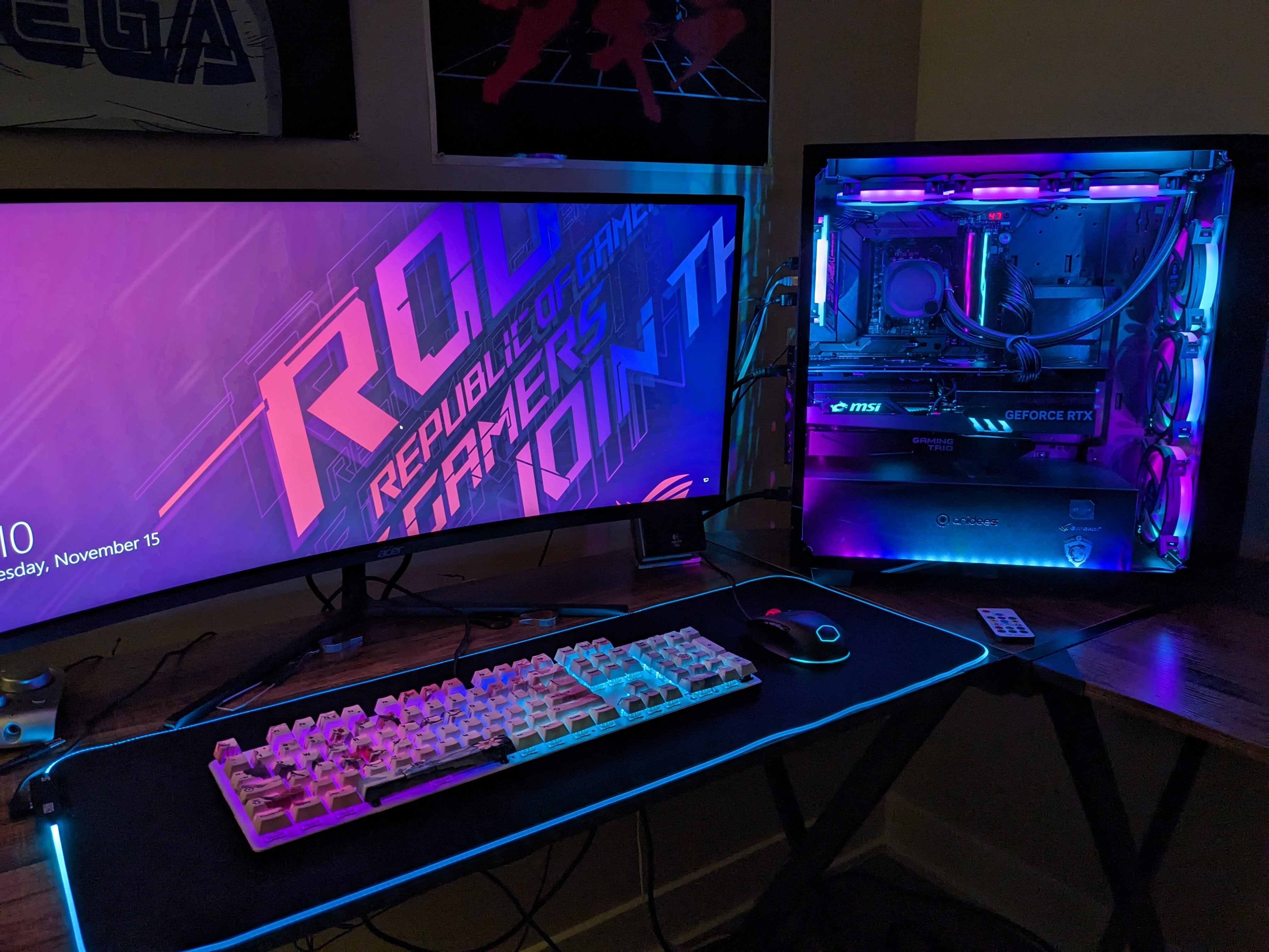
Hmm, Evo XL says it only supports 280mm radiators (at least from a glance), it also looks mostly identical to the O11D. Unless it's bigger. What size radiator do you use, it looked like a 360mm on the backside of your case? If you want a pretty nice case, that also has a cube option, check out anidees! We have two cases from them and they've been great. Airflow is not the best but mine basically has two filters in the front (thin vents on the side of the front glass, a removable 360 dust filter held on magnetically inside, with 3x 120mm fans behind it mounted inside the case). Their fans are nice too and seemingly dust proof. Come January I will have had this case for 5 years, and it stays really clean inside for the most part. I dust it every month or two and it stays really clean. PC Case Archives - anidess ANIDEES.COM Take a look at their different cases. The only problem with them is that they don't have much US availability, they used to have a limited selection on Amazon, but had everything on Newegg. Now on Newegg I only see one case and its a full tower. I even tried caseking.de and AliExpress, no go. Tbh I don't know where you can get their products anymore, but if you can find them they are worth it.
-
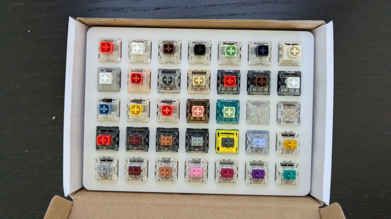
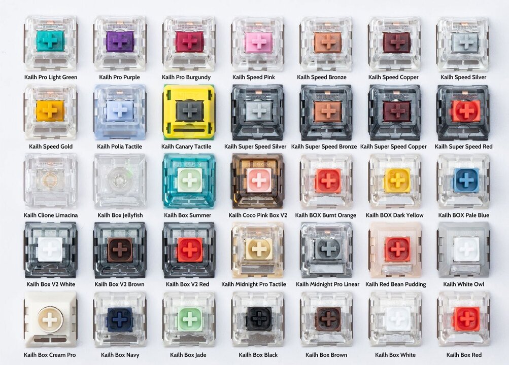
Got a Kailh switch tester. The Box Summer are really nice. Kind of like a modified Box Jade. Here's the guide:


