10 hours ago, iamjanco said:
Suggestion: If you're not simply toying around with what you've learned, best to stick with the existing tag lines. Anything else is doing a disservice to the brand.
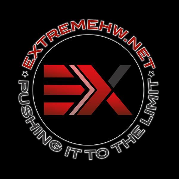
@neurotix @iamjanco. I like the input from both of you which has lead to the above design, I rather like this and on my next round of store changes I would like to use this. Am I able to have the raw file for this .PSD/Ai ?

£3000
Owned

Owned

£3000
Owned


1550x1313_042602.thumb.png.ed8d16edbf9ffeb97fae78226c394ffe.png)





Recommended Posts
@neurotix
Suggestion: If you're not simply toying around with what you've learned, best to stick with the existing tag lines. Anything else is doing a disservice to the brand.
Edited by iamjancoLink to comment
Share on other sites
damric
I want a ball cap. Someone buy me one and make my day. Are they only in white? I would prefer like charcoal gray.
null
Owned
Link to comment
Share on other sites
neurotix
Alright, noted.
Yours looks great btw.
{"USD":"5179"}
Owned
null
Owned
Link to comment
Share on other sites
Memmento Mori
I like it!
Put this on a metal cup in black and ill buy it for my coffee....
NoBodyKnow
Owned
Link to comment
Share on other sites
Avacado
Damn, that is sexy. I want.
Link to comment
Share on other sites
neurotix
Agreed.
He'd most likely need to scale it up to like 3000x3000 px at 300ppi on a transparent background for it to be usable on a shirt. At least, for the shirts I designed they needed to be very high res and transparent (the areas around his letters would all need to be on a transparent background.)
This makes sure that they aren't printing black on the shirt at all which ends up looking dark gray = it ends up looking like crap. The high res is what most printers need that Enterprise is using.
I would not be surprised if iamjanco doesn't want it used on a shirt, cup or hat though. I could be wrong, but he didn't seem too keen on having designs used other than to demonstrate. I don't want to and am not speaking for him though.
{"USD":"5179"}
Owned
null
Owned
Link to comment
Share on other sites
Guest